The most recent Design Issues' visual essay has arrived. It was again an honour to design it. It was also a pleasure - I thoroughly enjoy this ongoing project. Each essay presents its own puzzle. Some are comprised predominantly of images. Others include only introductory text and paratextual copy. Others, like Victor Margolin's The Bicycles of China, feature copy that is as important as its images. It is for this reason I was discouraged from thinking along the lines of template when developing this system several years ago. It needs to be flexible enough to accommodate different types of research. And flexibility, by definition, is a sort of durability or a stability.
Starting Him on Solids
A most special gift
Something very, very special has come my way by a immensely supportive and inspiring friend. More on this soon.
Franklin for Franklin
Dear Lawless,
Are we being clever, or lazy?
Gg
As mentioned, we're expecting. Only three more weeks! I am adorning Jr's nursery with what has become my new favourite letter and, not coincidentally, his initials: Gg (his name is a surprise). It has been many years since I've had a bevy of saws and a workshop at my disposal and even longer since I cut "signage." I selected Tuscan Egyptian originally from Hamilton Wood Type Foundry. I am shy of display typefaces and it required an element of discipline to have fun with this. A baby has been good for me already.
Greenboathouse Press - a visit
I had an excellent afternoon at Greenboathouse Press. Thank you, Jason for your time. You're busy!
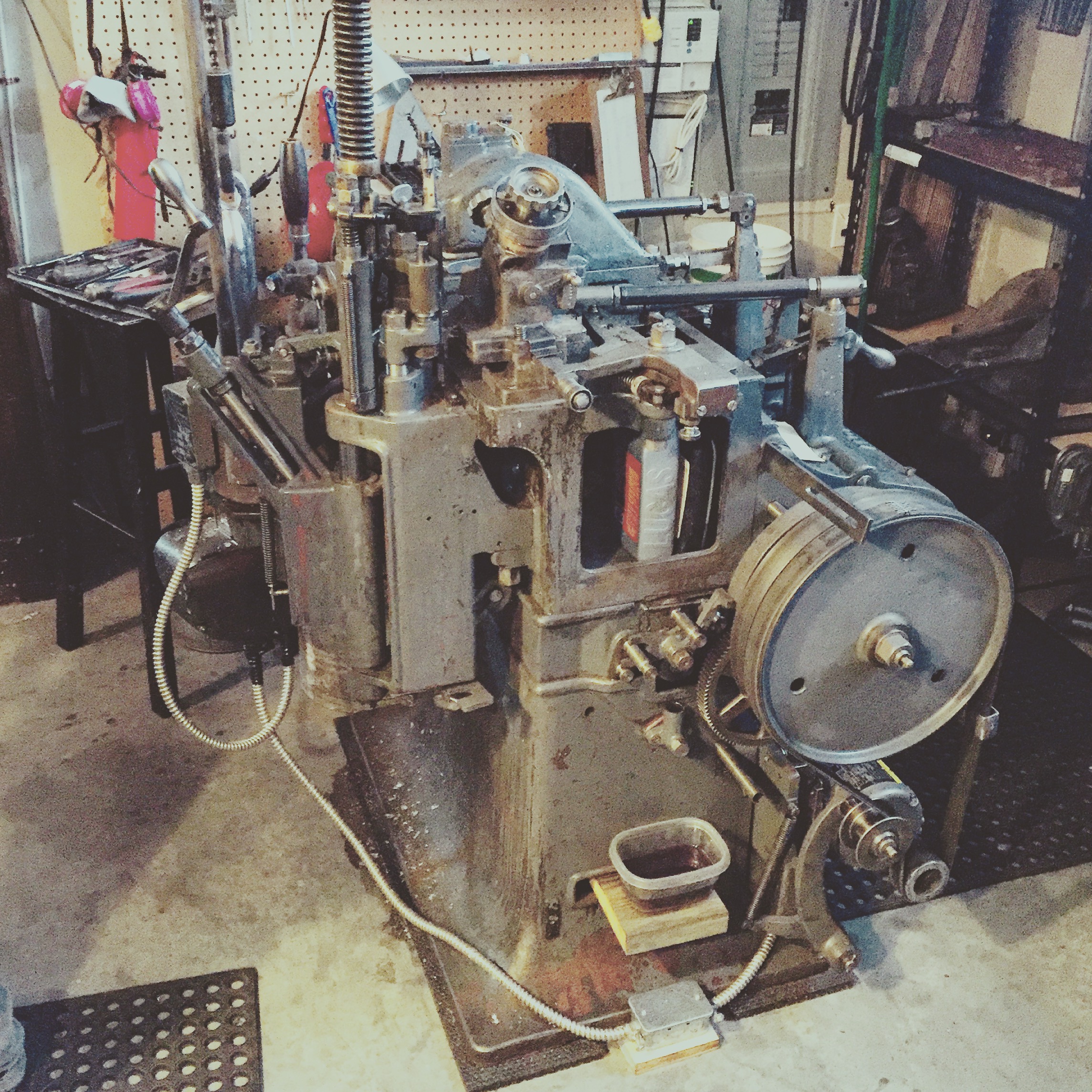
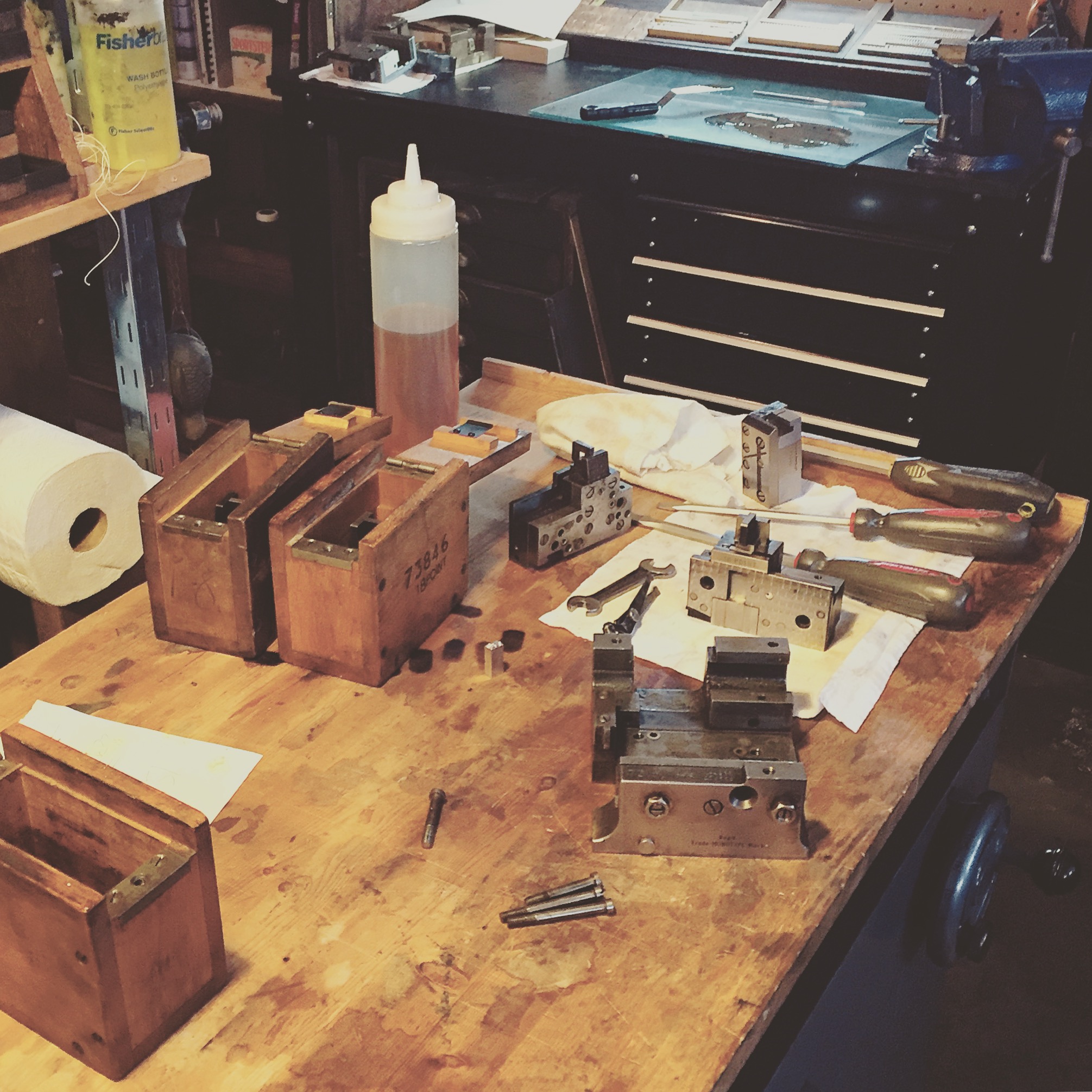
Left is Jim Rimmer's old (and rare) Monotype SuperCaster now owned by Jason Dewinetz who refurbished it himself (!!). Such a project was highly discouraged by veteran printers but he was not dissuaded.
The last time I saw this beast in action I was...a lot younger. It was in Peter Cocking's Design for Print class at ECIAD. We all went out to New West and had I known then how special that visit was and how relevant it was to my future I would have taken greater care to absorb every minute. Funny that I do have a very clear memory of the SuperCaster. It will cast some special type again soon enough.
Malcolm Gladwell and the perils of disfluency
Writers and Company is my favourite podcast. Some episodes I listen to several times. Recently, I returned to an archived interview with Malcolm Gladwell after the release of David and Goliath and was surprised to hear anew that at around 32:00 Gladwell refers to a study* operating on the premise that text made more difficult to read aids in the retention of information. I know this study. I have strong thoughts on this study. Broad strokes applied to specialized fields are rarely handled well by their enthusiasts.
Full disclosure: Prior to David and Goliath I had not read a single one of Gladwell's books. Articles, yes. Through those, I have come to think the world of him and imagine a reality in which we're friends.
The study states that educators typically gauge the success of a class according to the ease at which information is transmitted to students. The study suggests that easy transmission may actually be limiting educational performance and that perhaps having students apply more cognitive effort by “disfluency,” a term most familiar in the study of speech, would result in information being retained long enough for it to be applied more effectively. How is disfluency achieved? By adjusting type settings from the norm. This study’s hypothesis suggests that with minor disfluency comes the opportunity to “process information more deeply, more abstractly, more carefully, and yield better comprehension.” This research has been reported on in Wired, as well as other quality albeit less popular publications.
In the first experiment, 28 people via Princeton University's subject pool, ages 18-40, were given 90 seconds to memorize three species of aliens and their seven characteristics. The material was divided amongst the participants, some reading "disfluent" text (12pt Comic Sans at 60% black or 12pt Bodoni at 60% black) and others reading fluent text (16pt Arial at 100% black). After the 90 seconds, the participants were distracted for 15 minutes after which they were asked to recall the aliens and their characteristics by answering questions about them. Those given the disfluent text remembered details 14% more than those given the fluent text.
The second experiment involved 222 public high school students from a high-performance school in Ohio ages ranging from 15 to 18. 90% of students from this school pursue post-secondary education and the school boasts a 95% attendance rate. Teachers submitted both handout material and PowerPoint slides to experimenters who changed them one of two ways: a font change (Haettenenschweiler, Monotype Corsiva, Comic Sans Italic) or poor printing (material moved up and down on the photocopier). Students given the disfluent material got better grades in subsequent assignments than did those who worked with the fluent (control) material. The study concludes that retention of information is increased when students are given text that is not easy to read.
As one would expect, this study was met with opposition. The assumption is made that these minor adjustments demand a higher cognitive investment required in decoding a block of text. Decades of research in fluency would agree that “small interventions have the potential to make big improvements in the performance of our students and education system as a whole,” however manipulating text is most certainly not a long-term solution for high performance and factors of novelty and emphasis are not addressed. This approach distances students from the responsibility of engagement and fails to expand itself into the arena of curriculum development - the principles could apply to the development of the material itself - something Gladwell clearly understands.
Does Gladwell support bad type? Of course not. In calling attention to this study, he is stressing the value of applying effort in the face of adversity and nothing more. In fact, Gladwell is acknowledging good typography. Or at least, its power. Good writing deserves a smooth and direct transmission. Gladwell knows this; he doesn't want us working extra hard to read his work. Even if we did retain more of his material, would not our eyes tire of it long before we were finished? Communicating content is and always needs to be our number one.
The title of the piece, as it was printed in Cognition, is a good example. My eyes glazed right over "the Bold (and the Italicized)". But I confess a lower tolerance for poorly set type. I tend to dismiss with impatience lines of text that do not read clearly. Or beautifully. That or I'm just lazy.
*Fortune favors the Bold (and the Italicized): Effects of disfluency on educational outcomes. Cognition, 118, 111-115 (2011). Connor Diemand-Yauman, Daniel M. Oppenheimer, Erikka B. Vaughan
Work in Progress
WIP - title page in blue
Work in Progress
WIP - Scott Cairns' Adventures in New Testament Greek: Nous at Barbarian Press. My first rounds of edits.
Moving
In October, we are moving to Coldstream in BC's Okanagan. It's a temporary transplant that will end with the completion of my husband's contract and with me becoming a mom! Coldstream (Vernon) is beautiful, kind, and slower paced. I will continue to design and write until April 21-ish when baby arrives.


